CLIENT
Sophia is a jewelry manufacturing company. This company is available in unique production, which is made for women who appreciate refined taste, specific style and quality. It is not only jewelry, it is also an expression of luxury and elegance. Their designs emphasize the natural beauty of every woman, giving her self-confidence and a unique glow. The products are suitable for any occasion, from everyday wear to special events.
TASK: VISUAL IDENTITY
The aim of this project was to create a visual identification that would clearly and effectively reflect the elegance, professionalism and uniqueness of the products and strengthen the brand's position on the market.
DESIGN SOLUTION
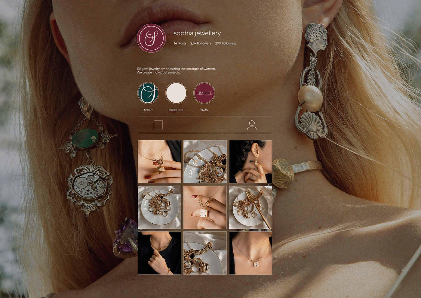
The logo has a minimalist and elegant style that reflects the style of jewelry. The symbol is the stylized first letter of the brand name "S".
The brand's colors have been selected to best suit the brand's values and the materials from which the jewelry is made.
Emerald green fits perfectly into the latest trends, referring to sophistication and nobility.
Ruby color: Due to its rarity and beauty, ruby also symbolizes individuality and uniqueness, which perfectly suits Sophia jewelry.
The color palette has been supplemented with almond and light pink, which are a contrast to the other colors.
Packaging and printed advertising materials were created using high-quality ecological papers and noble printing decorations - letterpress and hot-stamping.